
Building a Branded Lower-Third and Caption Style: Step-by-Step Guide
Building a Branded Lower-Third and Caption Style is the step that turns a folder of clips into a recognizable series. Without it, every editor makes fresh choices about fonts, colors, and placement, and the videos feel different each week. For founders, VC partners, and B2B SaaS, AI, and tech startups, a consistent style also signals credibility before the first sentence lands. This guide covers what a style system contains, where teams go wrong, and the eight steps we follow.
Quick Answer
Define a small style system: one lower-third layout, one caption treatment, brand colors, fonts, and safe-zone placement. Build reusable templates, test them on a phone, write a one-page spec, and review consistency across videos.
Why a Style System Matters
A lower third is a text title or graphic overlay placed in the lower region of the screen. Adobe's lower third guide notes that it lets you give context, such as a person's name and title, without pulling attention from the frame. Captions do a different job. The W3C Web Accessibility Initiative describes them as a text version of speech and non-speech audio, synchronized with the audio.
Together they carry your brand in two places viewers actually read. When both follow a fixed system, a viewer who has seen a few of your videos has a better chance of recognizing the next one in the feed before they see a logo. When each editor improvises, the series looks like several different companies.
There is a practical reason as well. LinkedIn's Creative Labs analysis of more than 13,000 B2B video ads describes a mobile-first, sound-optional environment. In that analysis, graphics that display key points on screen were associated with an 18% lift in engagement, and bulleted captions with a 30% increase in dwell time. Those figures come from paid LinkedIn ads and describe correlation, so I read them as a reason to design on-screen text carefully, not as a guaranteed lift.
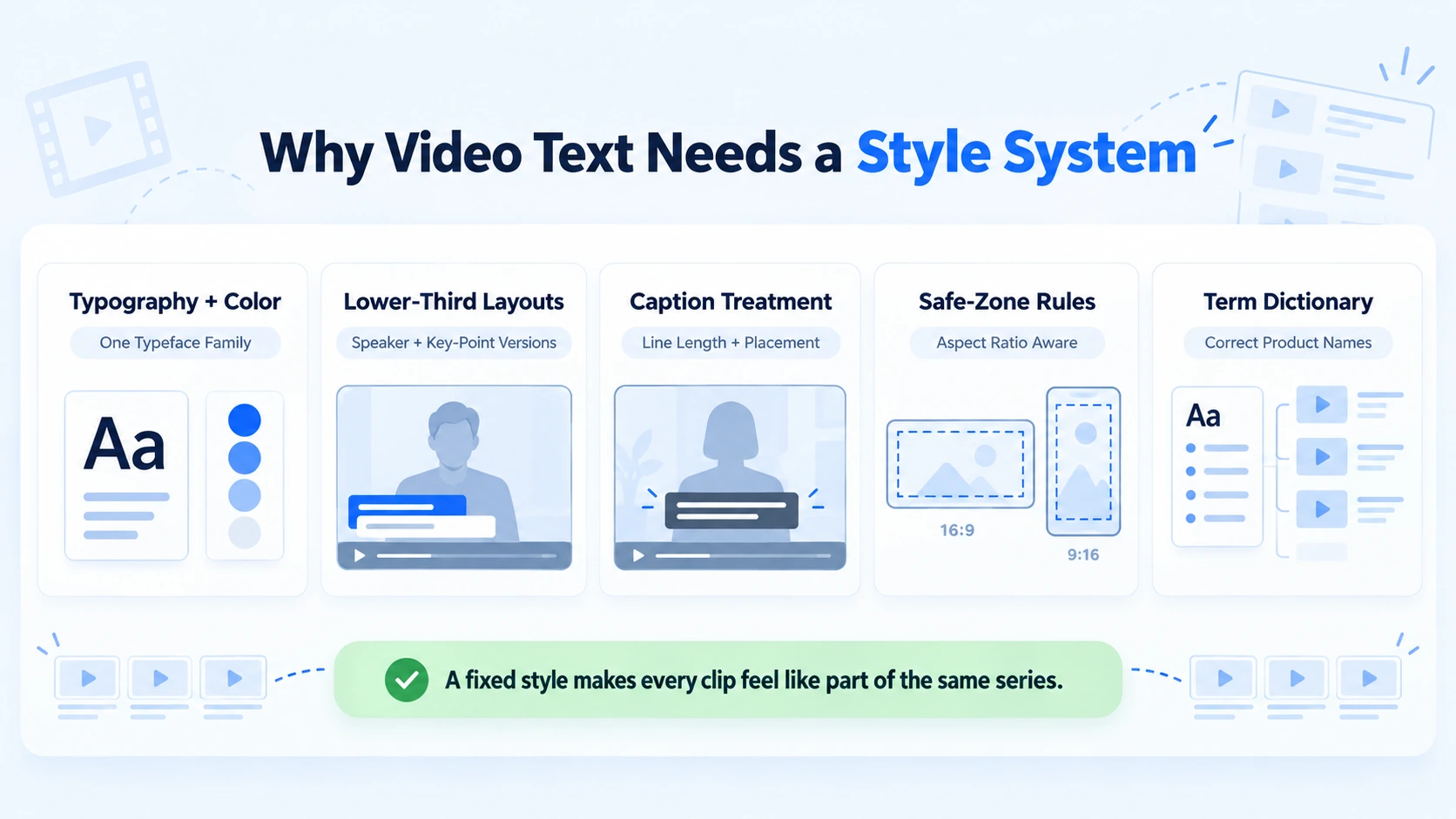
A working style system is smaller than most teams expect. It usually contains five parts:
- Typography and color: one typeface family, a short palette, and checked contrast.
- Lower-third layouts: a speaker version and a key-point version, with fixed position and timing.
- Caption treatment: line length, placement, emphasis color, and speaker labels.
- Safe-zone rules: where text may sit for each aspect ratio and platform.
- Terminology: a dictionary of product, firm, and person names that captions must spell correctly.
Everything else is a variation on those five.
Where Teams Go Wrong With Lower Thirds and Captions
Most problems with Building a Branded Lower-Third and Caption Style come from treating each video as a new design job. One mistake I see repeatedly is a brand guide that covers the website and the logo but says nothing about video text. These are the patterns that show up most:
- Inconsistent typography: two editors pick two fonts and two sizes, so the series looks unplanned.
- Overloaded lower thirds: name, title, company, and a tagline stacked together. Adobe's guidance warns against crowded type and unnecessary information, and notes that corporate lower thirds typically stick to essential information in the brand's colors.
- Low contrast: a brand color that works on a website but disappears over a bright office window.
- Collisions: captions and lower thirds sharing the same space, or captions running over text inside screen recordings.
- Ignoring platform interface: captions placed low, where the app draws its own buttons and caption text.
- Weak accuracy: product names, investor names, and technical terms misspelled by auto-captions and never corrected.
- Files nobody can find: the template lives on one editor's laptop, so it leaves when that editor does.
There is also a common approval problem. Without a spec, reviewers comment on taste in each video, and the same feedback returns every week. A one-page spec turns those comments into a check against agreed rules.
Building a Branded Lower-Third and Caption Style: The Step-by-Step Workflow
A typical version of this workflow has eight steps. It applies whether you are starting from scratch or turning existing recordings into formatted video assets. Small teams can compress some of them, and I say which ones after the list.
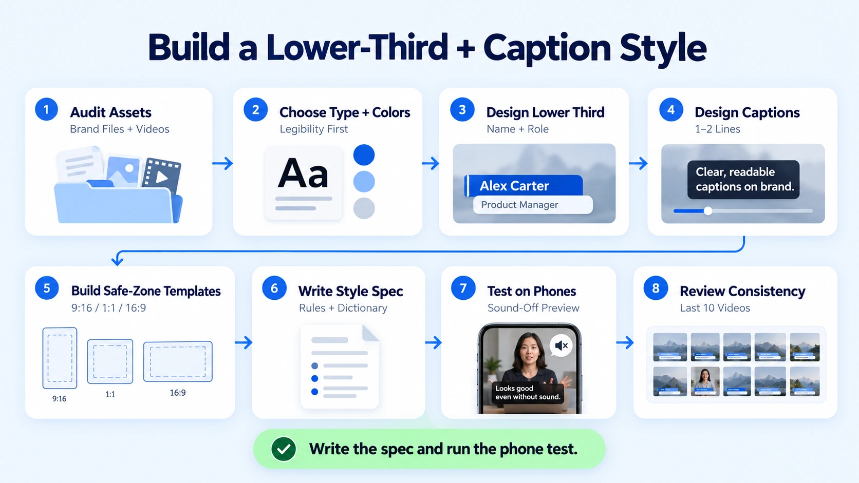
- Audit what you already have or map out new content needs. Gather your logo files, brand colors, fonts, and five or six recent videos if you have existing footage. If starting from scratch, map out your buyer positioning, scripting needs, and target ad or organic formats. Note what already works on screen and what varies between videos. This tells you whether you are building a system from scratch or fixing one.
- Choose type and colors for legibility first. Pick one typeface family with a bold and a regular weight. Then check the contrast. The W3C's contrast guidance for WCAG sets a minimum ratio of 4.5:1 for text, or 3:1 for large-scale text. WCAG is written for web content, so I treat those ratios as a practical benchmark for burned-in video text, not as a compliance claim. Test your palette over both bright and dark footage, and add a backing shape or outline when the footage varies.
- Design the lower third. Decide what it contains: a name and role, and nothing more for most videos. Adobe's lower third tutorial advises building a template around the longest name and title you expect, so everything fits. Keep the animation simple, place it inside the safe area, and time it to appear soon after the speaker starts. Make two or three variants: speaker, topic label, and key-point graphic.
- Design the caption style. Set a maximum line length, use one or two lines at a time, and keep them centered above the bottom interface area. Use your accent color on the key word or phrase only, not on every word. Add speaker labels when more than one person talks. Our captions and subtitles tutorial covers timing and line breaks in more detail.
- Build safe-zone-aware templates. Create one template per aspect ratio you publish: 9:16, 4:5 or 1:1, and 16:9. Adobe notes that motion graphics templates can expose editable elements such as color, animation, and text, and can be reused as often as needed. Give lower thirds and captions separate positions so they never overlap. Our guide to motion graphics that reinforce your message covers the animation side.
- Write the one-page style spec. Record typefaces, weights, colors with contrast checks, positions, timing, animation rules, caption rules, and a term dictionary of product, firm, and person names. Add a short do and don't list with screenshots.
- Test on real footage and real phones. Run the templates over newly produced test footage or existing assets—including dark footage, bright footage, b-roll with text, and a two-speaker conversation. Watch on a phone with the sound off, then check each platform's preview before publishing.
- Roll out, check, and review. Add a quality check to every export: correct spellings, no collisions, safe-zone placement, and template version. Review the last ten published videos each quarter for drift. If brand colors change, update the templates and the spec together. Our guide to color grading for a consistent brand look pairs well with this step.
If you only do two things in Building a Branded Lower-Third and Caption Style, write the spec and run the phone test. A small team can compress steps 1 and 5 by starting from a single template for the format it publishes most. I would not skip step 2 or step 7, because contrast and legibility problems are easy to catch before publishing and hard to fix afterward.
A short illustration
Here is a hypothetical style spec for a B2B SaaS and AI tech startup founder series, not a client project. It shows how few rules a working system needs.
The point of the table is that each rule answers a reader problem. If a rule does not, it does not belong in the spec.
Adapting the System to Audience and Platform
For VC and PE firms, restraint usually works best. A partner's name and fund role on a clean lower third, plain captions, and a small logo placement suit the tone. Portfolio company logos should appear only with permission. For B2B SaaS, AI, and tech startups, the term dictionary matters more, because product and technical names are where auto-captions most often need correction. Key-point graphics work well for explaining complex systems that are hard to picture. For founders and CEOs across tech and growth-stage companies, a lower third on first appearance is often enough, and the captions can do most of the work. Across all three groups, Building a Branded Lower-Third and Caption Style works best when the rules are written for the buyer's viewing context, which is usually a phone, often with the sound off.
Platforms draw their own interface over your video, so placement differs:
- Instagram Reels. Meta's Ads Guide for Reels recommends leaving at least 14% of the top, 35% of the bottom, and 6% of each side free of text, logos, and other key elements. It is written for ads, so I use it as a conservative guide for organic posts too.
- YouTube Shorts. Google's Shorts ads guidance says to avoid placing critical elements in the top 10%, the bottom 25%, and the right-hand 10% of the frame. That is where the channel name, caption, and engagement buttons sit.
- LinkedIn. I use the Reels margins for vertical cuts as a working rule, and I check each export on a phone.
- 16:9 long-form. Adobe describes the title-safe area as the part of the screen where graphics will not be cropped. Keep lower thirds inside it.
Because the two zones differ, I design one 9:16 template using the largest margin listed for each edge, then check it on each platform. Percentages are approximations, since devices and interfaces vary.
Reviewing Consistency and Deciding What to Delegate
You can judge Building a Branded Lower-Third and Caption Style with two kinds of checks. The first is consistency: open your last ten videos side by side and see whether fonts, colors, positions, and timing match. The second is performance. Compare retention or watch time on videos before and after a style change, and read the result carefully. A new style is rarely the only change between two videos, so treat the comparison as a signal and not as proof.
Match metrics to purpose. For awareness, look at reach, views, and completion. For engagement, look at saves, shares, comments, and watch time. For commercial impact, look at website visits, demo requests, and sales conversations. Attribution is imperfect, so use several signals instead of one dashboard number.
If you delegate this work, a capable partner should handle the whole chain: researching buyer needs, scripting, and providing recording guidance for new productions, or repurposing existing content libraries. They should also build the templates, write the spec, maintain the term dictionary, run quality checks on every export, and update the system when your brand changes. The value is not the templates alone. It is that someone owns them.
It helps to know what the finished deliverables look like. A complete handover usually includes the one-page spec, a template file for each aspect ratio, the term dictionary, and a quality checklist that every export passes before approval. If a provider cannot show you all four, the system is probably still living in one editor's head.
Conclusion
A branded lower-third and caption style is a set of decisions made once so that they do not have to be made again on every video. Choose legibility before decoration, keep each element to one job, and write the rules down where the next editor can find them. That is the practical meaning of Building a Branded Lower-Third and Caption Style. Editing creates the asset, and a consistent system is what makes each new asset recognizable as part of the same series.
FAQ
What does Building a Branded Lower-Third and Caption Style involve?
It involves defining how names, titles, and captions look and behave on screen: typeface, colors, position, timing, animation, and rules for terminology. The result is a set of reusable templates and a short spec, so any editor can produce the same look on every video.
What information should a lower third show?
For most videos, a name and a role. Adobe's guidance notes that corporate lower thirds typically stick to essential information in the brand's colors. Add a company name only when the audience would not otherwise know it, and avoid taglines, which crowd the frame.
How long should a lower third stay on screen?
Long enough for a viewer to read it once at phone size, and no longer. Most of mine run a few seconds, but that is a habit and not a benchmark. Test it on a phone with the sound off, then adjust for how long the name and role actually are.
Should captions be burned in or uploaded as caption files?
Each has a trade-off. The W3C notes that open captions cannot be turned off, while closed captions can be shown or hidden by viewers. Burned-in captions give you full control over style. Caption files give viewers control and are easier to correct later. Where a platform allows both, consider providing a file alongside styled captions.
What affects the cost of building a caption and lower-third system?
Cost depends on how many aspect ratios you need, the number of lower-third variants, animation complexity, template building in your editing software, the term dictionary, and how many rounds of revision your team needs. Ask whether a quote covers only design or also ongoing quality checks on each export.
Should I use a freelancer, an agency, or an in-house editor?
A freelancer or in-house editor can build a solid system if they have design skill and time to write the spec. An agency fits teams that want the system built, maintained, and applied across a steady volume of videos, along with content selection and distribution. The right choice depends on how much of the chain your team wants to own.
Does a small team need a full style system?
No. Start with a one-page spec covering one typeface, one caption treatment, one lower-third layout, and safe-zone placement. That is enough to stop drift. Add variants and templates for more aspect ratios only when you publish enough videos to need them.
Does Komet Media build caption and lower-third templates?
Yes. Whether clients have an established content library or are starting completely from scratch without existing video assets or recordings, Komet Media handles the entire production process—including buyer research, scripting, recording guidance, editing, formatting, style specs, term dictionaries, motion graphics, and platform exports. We work best with B2B SaaS, AI, and tech startups, venture and private equity firms, founders, and executives who tie video to business goals. Our recurring work typically ranges from about $2,500 to $5,000, depending on scope, volume, production difficulty, turnaround, and distribution needs. It is not a fixed public package. You can book a call to discuss your setup.

