
Color Grading for a Consistent Brand Look: Step-by-Step Guide
Every video your brand publishes is a visual handshake with a potential buyer. When the colors shift between your founder's LinkedIn clips, your product demos, and your webinar cuts, that handshake feels limp. This color grading for a consistent brand look step-by-step guide fixes that. I'll walk you through exactly how we build a repeatable color system at Komet Media for B2B SaaS, AI, and tech startups & teams—whether creating content from scratch or editing and color grading existing footage—so that every short-form video, repurposed clip, and long-form asset feels unmistakably on-brand.
TL;DR
- Color grading is creative; color correction is technical. You need both, in that order.
- Build your brand LUT once, apply it everywhere: Adobe Premiere Pro, DaVinci Resolve, across every editor on your team.
- Maintaining a consistent color palette across logos, content, and promotional materials can increase recognition by up to 80%.
- Lock your hex codes, Pantone values, and color temperature targets in your brand style guide before touching a single clip.
What Is Color Grading in Branding (and Why It's Not Just "Filters")?
Color grading and color correction are two distinct steps in a post-production workflow, and confusing them is one of the most common reasons brand videos look inconsistent. Color correction handles the technical adjustments to fix exposure, white balance, and contrast so footage looks natural and consistent.
It is the foundation: every clip should pass through color correction first so you are working from a neutral, calibrated baseline before any creative decisions are made. Color grading is what happens next. LUTs transform the color in video footage to create a mood or set the tone of your video. That mood is your brand. For a B2B SaaS team, that might mean cooler color temperature to signal precision and trustworthiness, pulled slightly toward the blue-green spectrum using hue saturation curves. For a funded AI startup, it might be a warmer, high-contrast grade that signals energy.
Here is why this distinction matters for branding specifically: if you apply a creative grade before correcting exposure and white balance, the result will differ every time lighting changes on set. Your brand palette, expressed as specific hex codes and Pantone references in your visual identity guidelines, cannot survive inconsistent source footage unless correction comes first. Color psychology compounds the stakes. Color predicts 34.5% of the variation in purchasing decisions, according to research in the Journal of Marketing and Social Research (2025).
For B2B buyers who are watching a founder's video before booking a demo, the emotional signal your color grade sends is shaping trust before a single word registers. A warm, high-contrast grade that clashes with your product UI's cool-toned RGB color model will create subconscious friction, even if no buyer can articulate why.
The RGB color model underpins every digital color decision. Red, green, and blue channel values, expressed as numbers from 0 to 255, determine every pixel. Your brand hex codes (e.g. #1A2EFF) are direct translations of those RGB values, and your color grading process should always reference those codes as the target destination, not a general vibe. The chromatic aberration issue is also worth flagging here: lens-induced color fringing along high-contrast edges should be corrected before grading begins, as it will otherwise be baked into your brand LUT and become a permanent artifact.
Step-by-Step Color Grading for a Consistent Brand Look
This is the workflow I use across every video editing project at Komet Media for B2B SaaS, AI, and tech startups & teams—whether we are guiding production and scripting content from scratch or working with your existing recordings. Follow it in sequence.
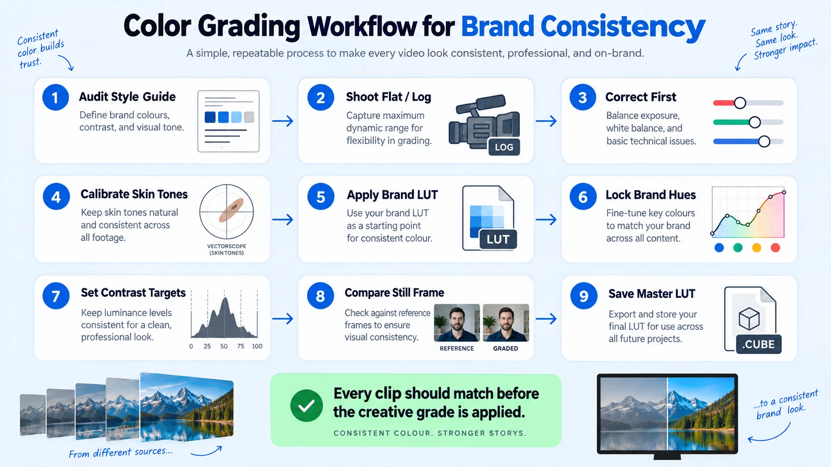
- Audit your brand style guide: Pull your exact hex codes, Pantone values, and any color temperature guidelines documented by your design team. These are your targets.
- Shoot in a flat or log profile: Flat footage preserves maximum dynamic range and gives you full control during color correction. Standard profiles bake in contrast and limit what grading can recover.
- Correct first: In Adobe Premiere Pro's Lumetri Color panel or DaVinci Resolve's Color page, normalize exposure, fix white balance, and set your black and white points. Every clip in a series should match on a waveform scope before you grade.
- Calibrate skin tones: Skin tone calibration is non-negotiable for founder-led video. Use the vectorscope's skin tone indicator line to ensure faces read naturally across different lighting setups. Deviations in skin tone across episodes destroy the sense of a consistent visual identity.
- Apply your brand LUT: Load your custom or curated brand LUT into the Creative slot in Lumetri, or onto a dedicated node in DaVinci Resolve. The best workflow is usually a hybrid: use crafted LUTs to get 60–80% of the way there, then use manual grading to dial in contrast, skin tones, and local adjustments.
- Use hue saturation curves to lock brand colors: Push specific hues toward your Pantone/hex targets using the Hue vs. Saturation and Hue vs. Hue curves. This is where your brand palette gets precise.
- Set contrast ratio targets: Define a minimum and maximum luminance range for all brand videos. Consistent contrast ratio is as important as consistent color hue.
- Export a still and compare: After grading, export a frame and place it next to your brand style guide color swatches. If the dominant tones do not match your hex codes visually, adjust before exporting the full video.
- Save your grade as a reusable LUT: Export the final grade as a .cube file. This is your master brand LUT.
Best Color Grading Tools for Brand Consistency
The two platforms that matter for professional brand work are Adobe Premiere Pro and DaVinci Resolve.
Adobe recently rebuilt Premiere's color processing pipeline with a Wide Gamut Color Pipeline that better preserves log and RAW footage details and provides more predictable results without relying on technical LUTs. DaVinci Resolve began as a dedicated color grading platform and remains one of the most powerful tools for professional color work, using nodes as modular blocks that represent color steps or effects. For teams grading across multiple editors, nodes make it easier to pass grades between collaborators without breaking the underlying structure.
The core color tools are available in the free version of Resolve, making high-end grading accessible without subscription costs. For teams running short-form video editing at volume—whether editing existing footage or creating video assets from scratch—the choice often comes down to the ecosystem: if your team lives in Adobe, stay in Premiere Pro. If color accuracy and precision are the priority, move final grades into DaVinci Resolve.
What LUTs Should You Use for Brand Consistency?
LUTs (Look-Up Tables) are the primary mechanism for applying a repeatable color grade across every video your brand produces. LUTs allow you to achieve color consistency across your projects or different clips in a single project and add the possibility to work with the same LUTs in multiple software or displays.
There are two types that matter for brand work:
- Technical LUTs: Convert log or flat footage to a standard display color space (Rec.709). These normalize footage before any creative grade is applied. Broadcast teams use technical LUTs to convert log footage to display color spaces.
- Creative (brand) LUTs: Apply your specific look, color temperature bias, contrast curve, and saturation targets. This is your visual identity encoded as a file.
1D LUTs adjust channels independently, which is good for simple tone curves. 3D LUTs map RGB in a 3D cube, handling complex interactions for cinematic looks with fewer artifacts. For brand consistency work, always use 3D LUTs. For quality, 33-point and 65-point 3D LUTs are common choices.
Build your own brand LUT rather than buying a generic pack. A "cinematic teal and orange" LUT is not a brand color system. Your brand LUT should be derived from your hex codes, Pantone values, and the tone mapping decisions that match your visual identity.
The process: correct a representative clip to a neutral baseline, manually grade it to match your brand palette using hue saturation curves and color wheels, then export that grade as a .cube file in DaVinci Resolve (Color menu > Generate LUT) or via a third-party plugin in Premiere Pro. Every editor on your team applies that single file to maintain video marketing consistency, regardless of which camera or location produced the source footage.
LUT packs are delivered as .cube, .3dl, or .look files compatible with After Effects, Adobe Premiere Pro, DaVinci Resolve, Final Cut Pro, and Apple Motion , so your brand LUT is portable across the full stack.
How to Match Colors Between Different Videos for the Same Brand
This is the operational challenge that trips up B2B teams producing video at scale: a founder interview shot in a bright office, a product demo recorded via screen capture, and a webinar clip with flat lighting need to all feel like the same brand. The solution is a color matching protocol, not just a LUT. Here is how to execute it:
- Designate a reference clip: Pick one well-lit, well-exposed clip as your master reference. This is the visual standard every other clip will be graded to match.
- Use scopes, not your monitor: Waveform and vectorscope readings are objective. Your monitor's brightness and color calibration will lie to you. Always match by scope values.
- Match luminance first: Get black and white points aligned before touching any hue controls. Luminance mismatches are more disruptive to perceived consistency than subtle hue shifts.
- Use DaVinci Resolve's Color Match feature: In the Color page, right-click on a clip and select "Color Match" to automatically align it to a reference frame. Treat this as a starting point, not a final answer.
- Apply the brand LUT last: Once clips are matched to each other, apply the brand LUT as the final node or adjustment layer. This ensures the creative grade lands consistently on top of corrected, matched footage.
- Spot-check with Gallery Stills: In DaVinci Resolve, save Gallery Stills of graded reference clips. Use the split-screen wipe tool to compare new clips against saved stills before sign-off.
For teams repurposing webinar and podcast content or building new video programs from scratch, this protocol means every asset, regardless of original recording conditions, exits post-production with your brand's color signature intact.
Common Color Grading Mistakes That Hurt Brand Identity
These are the errors I see most often when B2B teams grade video without a defined system.
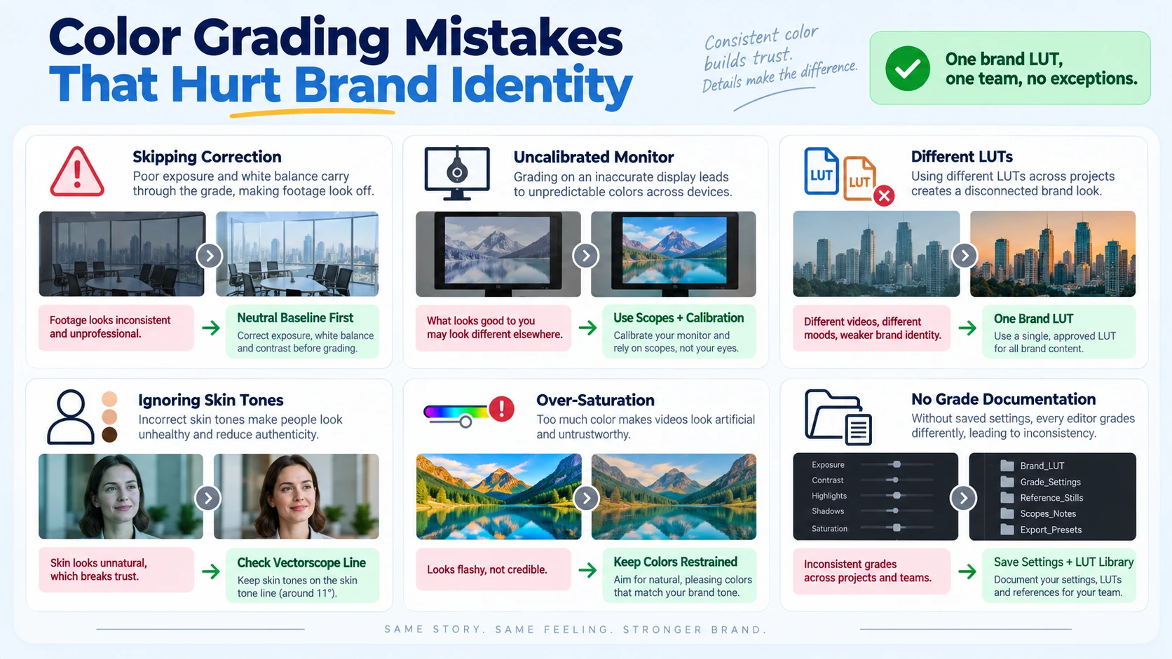
- Skipping color correction and going straight to grading: The brand LUT will amplify exposure and white balance inconsistencies rather than hide them. Every clip must be corrected to a neutral baseline before any brand grade is applied.
- Grading on an uncalibrated monitor: If your monitor skews warm, you will compensate by pulling the footage cool, and the exported video will look cold on calibrated screens. Use scopes and invest in monitor calibration.
- Using different LUTs across episodes: One editor uses "Cinematic A," another uses "Cinematic B." The result looks like two different shows. One brand LUT, one team, no exceptions.
- Ignoring skin tone calibration: 78% of people remember a brand's color, while only 43% recall the brand name alone. If your founder's skin tone shifts between episodes, viewers register the visual inconsistency as a brand reliability signal, not a camera problem.
- Over-saturating to "pop": High saturation clips feel consumer-grade. B2B buyers associate restrained, precise color palettes with trustworthy, premium brands. Dial it back.
- Not documenting the grade: A brand LUT without documented color temperature settings, contrast ratio targets, and hue saturation curve values is fragile. When an editor leaves, the system breaks. Write it into your brand style guide and store the .cube file in a shared team library.
Companies maintaining strict brand consistency guidelines saw an average revenue uplift of 23% compared to just 8% for inconsistently branded peers. The color grading mistakes above are not aesthetic nitpicks; they are revenue leaks.
Conclusion
A color grading system is a business asset, not a creative luxury. Here is what to take away:
- Define your brand palette in hex codes and Pantone values first, then encode it into a 3D brand LUT.
- Always run color correction before color grading, and calibrate skin tones for every founder or executive on camera.
- Use scopes, a reference clip protocol, and Gallery Stills to match colors across every video type, including repurposed webinars, demos, and podcast clips.
- Store the brand LUT and all grade documentation in a shared library so any editor on your team can apply it without guesswork.
If you want this built and managed for your B2B SaaS, AI, or tech startup & team, explore Komet Media's video services or get in touch directly.
Frequently Asked Questions
Q1: What is the difference between color correction and color grading for branding?
Color correction is technical: fixing white balance, exposure, and contrast so footage looks neutral and accurate. Color grading is creative: applying your brand's specific color palette, tone, and mood on top of corrected footage. For brand consistency, you always correct first and grade second. Skipping correction makes grading results unpredictable across different shooting conditions.
Q2: How do I create a brand LUT for my company's videos?
Correct a well-lit reference clip to a neutral baseline, then manually grade it to match your brand's hex codes and Pantone targets using hue saturation curves and color wheels. Export that grade as a .cube file (3D LUT format). Store it in your team's shared library and apply it as the final step in every video's post-production workflow.
Q3: Can I use the same LUT in both Adobe Premiere Pro and DaVinci Resolve?
Yes. LUT files in the .cube format are compatible with both tools. In Premiere Pro, load it via the Lumetri Color panel's Creative section. In DaVinci Resolve, apply it via a dedicated LUT node on the Color page. This cross-platform compatibility means your brand grade travels with your team regardless of which software individual editors prefer.
Q4: How many colors should my brand use in video color grading?
Keep it to one or two dominant color tones. A 2026 Interbrand analysis found that brands adhering to a strict one or two-color logo system scored 31% higher on brand clarity metrics and 27% higher on cross-platform consistency scores compared to those using three or more. The same principle applies to video: fewer colors, more recognizable.
Q5: How do I maintain color consistency when multiple editors work on the same brand?
Store your master brand LUT in a shared cloud folder and document all accompanying grade settings (color temperature, contrast ratio targets, saturation levels) in your brand style guide. Every editor applies the same LUT file and references the same documented parameters. Use DaVinci Resolve's Gallery Stills as visual reference checkpoints before any video is approved for export.
Q6: Does color grading really affect B2B buyer perception?
Yes, and the data is direct: 35% of marketing leaders report 10–20% revenue growth directly attributable to brand consistency, and 33% report gains exceeding 20% (Marq, 2025). For B2B SaaS teams running founder-led video and product demos, a visually inconsistent brand signals operational looseness to buyers evaluating whether to trust your product. Color grading for a consistent brand look is as much a sales enablement decision as a creative one.

