
Designing Thumbnails That Earn Clicks: Step-by-Step Guide
Most B2B founders and marketing teams I work with obsess over video quality and completely ignore the one asset that determines whether anyone watches at all: the thumbnail. Thumbnails and titles are the two most powerful levers for click-through rate, but thumbnails almost always carry more weight in attracting a casual scroller to pause and click. This guide on designing thumbnails that earn clicks gives you the exact framework I use at Komet Media for clients who need buyer attention, not just impressions.
TL;DR
- 90% of top-performing videos use custom thumbnails, a gap between 4% and 12% CTR can translate to 25x more views from the same impression pool.
- Use Visual Hierarchy, Color Psychology, and human faces to dominate the feed.
- Run A/B tests inside YouTube Studio, test one variable at a time.
- Treat brand consistency as a non-negotiable, not an afterthought.
What Actually Makes a YouTube Thumbnail Get More Clicks
Before you open Canva or Adobe Photoshop, you need to understand what the viewer's brain is doing in the millisecond before a click. Your thumbnail has roughly 1.5 seconds to stop a scroll. Get the color wrong and you've lost the click, no matter how good your video is. That window is governed by two cognitive systems: pattern recognition and emotional response. Thumbnails that win exploit both.
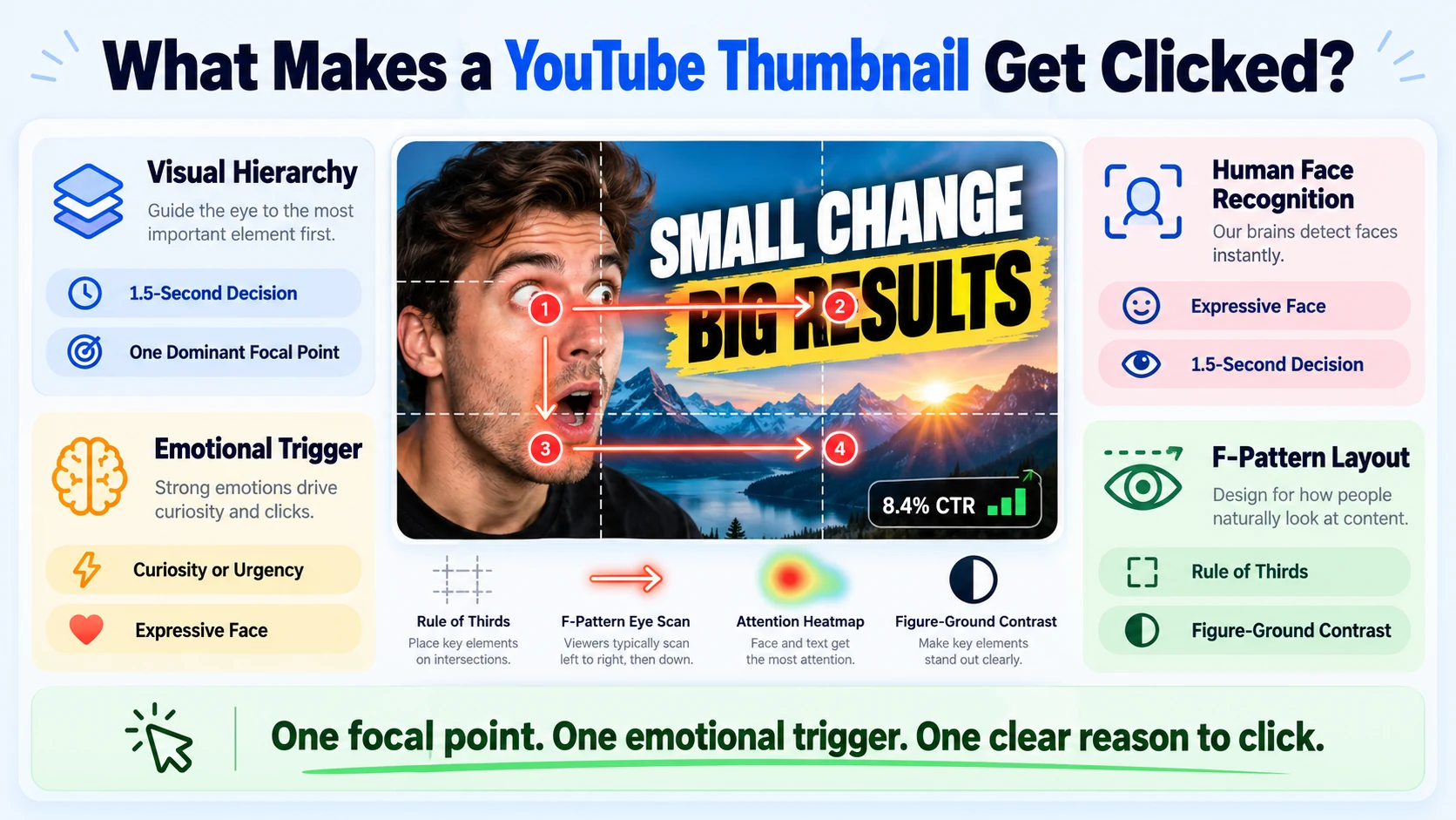
Visual Hierarchy: The brain scans for a dominant focal point first, then moves to supporting elements. Apply Gestalt Principles here, proximity, similarity, and figure-ground contrast determine what gets noticed and in what order. Violate these principles and your thumbnail feels noisy, which means it gets skipped.
Human Face Recognition: The brain is hardwired to process faces before almost anything else.
Thumbnails with expressive human faces can lift click-through rate by 20% to 30% versus neutral or faceless designs. MrBeast's thumbnails are the textbook case, exaggerated expressions, direct eye contact, high contrast. Every element points to the face; the face carries the emotional trigger.
Emotional Triggers and Cognitive Bias: Curiosity gaps, social proof signals, and loss-aversion framing all push the viewer toward the click before they've consciously evaluated anything. The thumbnail should surface one dominant emotional prompt, curiosity, surprise, urgency, or aspiration, never all four at once.
F-Pattern Layout: Eye-tracking research consistently shows that viewers scan digital content in an F-shaped pattern: strong left edge, top-right pull. Place your focal point at a Rule of Thirds intersection on the left or center, and anchor text along the top or bottom third. This isn't optional, it's how human eyes work on a grid.
For B2B teams using video to support sales and pipeline, these principles matter doubly because your buyer is moving fast and judging credibility in the same glance.
Step-by-Step: How to Design Thumbnails That Earn Clicks from Scratch
This is the exact process I walk clients through when building a thumbnail system from zero.
- Start with the right canvas: Set dimensions to 1280×720px at 72dpi. The standard dimensions are 1280 pixels by 720 pixels (16:9 aspect ratio), with a minimum width of 640 pixels. Save as JPG, PNG, or GIF under the 2MB size limit.
- Define your focal point: Choose one hero element, a face, a product, a bold number. Every other design decision supports that element. If two elements compete for attention, remove one.
- Apply the Rule of Thirds: Divide your canvas into a 3×3 grid. Place your focal point at one of the four intersection points. Place the subject at a rule-of-thirds intersection, leave 30–40% as negative space, and use layer stacking for depth.
- Build your color layer: Choose 2–3 colors maximum. Stick to 2–3 dominant colors. A common structure is a bright, saturated foreground color against a dark or desaturated background.
- Add text sparingly: Aim for 1 to 4 words maximum. The goal is instant comprehension. Use bold font pairing, one display font for the headline, nothing else. Size it so it's legible at thumbnail scale on mobile.
- Apply contrast check: Use complementary color pairings (yellow on violet, red on cyan, blue on orange) to maintain a 4.5:1 contrast ratio at mobile size.
- Run the squint test: Blur your eyes or step back from the screen. If you can still identify the focal point and read the text, it passes. If everything merges into noise, simplify.
- Export and upload to YouTube Studio as a custom thumbnail immediately after publishing the video.
For teams working on short-form video editing at scale, building a reusable template at step 3 cuts production time by 60% across a content series.
What Colors Work Best for Thumbnails That Earn Clicks
Color Psychology is not decoration, it's a conversion mechanism. What matters is contrast, context, and limiting your palette. Here's how the major colors stack up based on current CTR data:
One counterintuitive rule:
YouTube's default interface is bright white, which means dark thumbnails with bright accents can achieve roughly 70% higher CTR than light ones, simply because they create "reverse contrast" against the page. For B2B SaaS thumbnails specifically, deep blue backgrounds with orange or yellow accents read as authoritative and energetic simultaneously, exactly the trust signal a buyer needs before clicking a demo walkthrough. High-contrast thumbnails with bold colors like yellows and oranges can increase CTR by 20–30% according to VidIQ's design guidance.
Thumbnail Design Mistakes That Kill Your Click-Through Rate
I see these errors consistently across B2B video content. Each one is fixable in under 10 minutes. Four thumbnail mistakes consistently destroy CTR: clickbait that tanks retention, inconsistent branding across the channel, visual overcomplication, and designing exclusively for desktop without testing at mobile scale. Let me break each down:
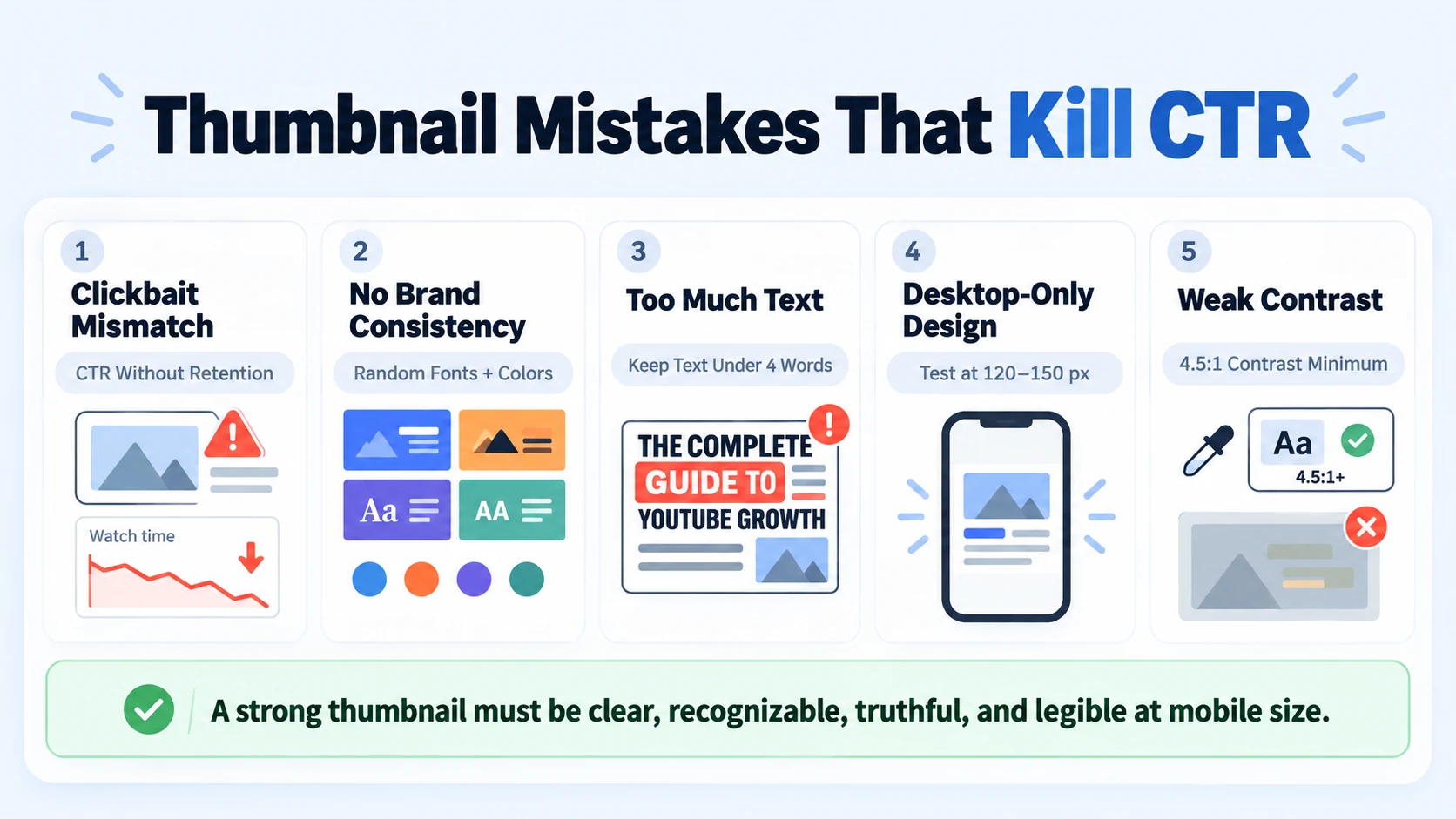
- Clickbait thumbnails: A misleading thumbnail with a high CTR but low watch time will get demoted faster than a low-CTR thumbnail with strong retention. YouTube's algorithm penalizes the bait-and-switch hard. Your thumbnail needs to represent what's actually in the video.
- No brand consistency: Random fonts, random colors, and random layouts mean every video feels like it came from a different channel. Viewers don't build recognition. Create a simple style guide with 2–3 brand colors, one primary font, and a consistent placement for your logo or a signature border.
- Too much text: More than 4 words is almost always a mistake. Text that requires reading rather than scanning kills the instinctive click. Run Font Pairing with one strong display face only.
- Designing at desktop scale only: YouTube thumbnails are designed at 1280×720 but consumed at 120 to 150 pixels on a phone screen. At that size, color contrast isn't a design preference, it's legibility.
- Ignoring the Contrast Ratio: Two colors close in brightness merge into a muddy tone at thumbnail size. Always verify a minimum 4.5:1 contrast ratio before publishing.
For video marketing teams building content at volume, these mistakes compound. One inconsistent template pollutes the entire channel's brand signal.
How to Use Canva and Adobe Photoshop to Design Thumbnails That Stand Out
Both tools work. The right choice depends on your team's speed requirements and design complexity.
Canva is the faster route for most content teams. Start with a blank 1280×720px canvas, not a Canva YouTube thumbnail template (most are visually generic and over-designed). Build your own master template, then duplicate and modify for each new video. Key Canva moves for high-CTR thumbnails:
- Use the "Background Remover" tool to isolate faces or product shots cleanly.
- Apply brand fonts via Brand Kit, never let contributors use system defaults.
- Use Canva's color palette tool to lock in your 2–3 brand colors.
- Export at maximum quality (PNG for sharp edges, JPG for smaller file sizes).
Adobe Photoshop gives you finer control over masking, color grading, and layer effects. It's the better choice when you're placing a real person's image against a custom background or color-grading a screenshot from a product demo. Key Photoshop workflow for thumbnails:
- Build a Smart Object layer for the background so you can swap it across multiple thumbnails without rebuilding.
- Use the Hue/Saturation adjustment layer to push colors to the high-contrast range without destructive edits.
- Save a PSD master template per series, then save individual exports as JPGs.
Both tools support A/B testing workflows: design two variants, upload both, and let YouTube Studio's Test & Compare feature decide. YouTube Studio now integrates thumbnail testing features that let you test up to three thumbnail variations simultaneously and gather statistically significant data on which designs perform best.
Teams producing podcast content or webinar clips benefit from building Canva templates per content type, one for podcast clips, one for demo walkthroughs, one for founder commentary.
How to A/B Test Thumbnails and Lock In What Works
Designing thumbnails that earn clicks is not a one-time event. It's a testing system. YouTube introduced "Test & Compare" to a limited set of creators in 2023, expanding it in 2024–2025. The company revealed that CTR differences of even 0.5% can be statistically significant over time when measured across millions of impressions. Here's the testing protocol I recommend:
- Create 2–3 variants that each change one variable only: background color, text vs. no text, face expression, or composition layout.
- Upload all variants via YouTube Studio's Test & Compare tool in the thumbnail section.
- Wait for significance: A test needs at least 2,000 impressions per variant before the results are meaningful. Drawing conclusions from 200 impressions leads to false positives. YouTube Studio indicates when results are statistically significant, trust the indicator, not gut feeling after a few hours.
- Run the test for a minimum of 7 days to account for audience behavior variation across weekdays and weekends.
- Commit to the winner and update permanently.
- Log the result in a thumbnail playbook: record which variable won, by how much, and for which content type.
Tools like TubeBuddy and VidIQ layer additional analytics on top of YouTube Studio, including competitor thumbnail benchmarks and historical CTR trend data. Use them to pressure-test your templates against what's already working in your niche.
The most successful channels test thumbnails on every video and maintain a record of what works. Over 20–30 tests, clear patterns emerge specific to the channel's audience. These patterns become the channel's thumbnail formula, a replicable system rather than one-off creative gambles.
Top creators achieve a click-through rate of between 5–10% through systematic thumbnail testing and optimisation, whereas average channels only reach 3–4%. The gap between those two numbers is entirely a systems problem, not a talent problem.
For B2B teams running video advertising or YouTube video editing at scale, this playbook is the asset that compounds, each test makes the next one cheaper to run and faster to win.
Conclusion
Designing thumbnails that earn clicks comes down to three repeatable habits: build for the viewer's brain first (Visual Hierarchy, face recognition, emotional triggers), apply Color Psychology and Contrast Ratio at mobile scale, and run structured A/B tests in YouTube Studio until patterns emerge.
- Every thumbnail needs one focal point, 2–3 colors, and no more than 4 words of text.
- Human faces with expressive reactions consistently outperform faceless designs.
- Dark backgrounds with bright foregrounds beat flat light-on-light layouts in most feeds.
- A thumbnail testing playbook is a business asset, document what wins and replicate it.
If your team is producing video content and needs the thumbnail strategy to actually convert into pipeline, talk to us at Komet Media.
Frequently Asked Questions
Q1: What size should a YouTube thumbnail be in 2026?
The standard is 1280×720px at a 16:9 aspect ratio, saved as JPG or PNG. File size must stay under 2MB. Design at full resolution but always squint-test it at 150px to simulate how it appears on mobile feeds before publishing.
Q2: How many words should I put on a thumbnail?
Aim for 1–4 words maximum. The goal is a single scannable phrase that creates a curiosity gap or states a clear outcome. More than 4 words requires reading rather than scanning, which kills the instinctive click response entirely.
Q3: Do I need a human face in every thumbnail?
Not every time, but face-forward thumbnails consistently outperform faceless ones. Expressive human faces can lift click-through rate by 20% to 30% versus neutral or faceless designs. For B2B content, a founder's expressive reaction shot beats a product screenshot almost every time.
Q4: What is a good CTR for a YouTube thumbnail?
A good YouTube thumbnail CTR ranges from 5–7% for strong performance, though averages sit at 3–4%. For B2B channels with smaller, more targeted audiences, focus more on watch time and conversion behavior than raw CTR benchmarks.
Q5: Should I use Canva or Adobe Photoshop for thumbnails?
Canva is faster for teams producing content at volume, build a master template and duplicate per video. Photoshop gives finer control for complex compositing (removing backgrounds, color grading product shots). Most B2B teams are better served starting with Canva and graduating to Photoshop as volume increases.
Q6: How long should I run an A/B test on a thumbnail?
A test needs at least 2,000 impressions per variant before the results are meaningful. Run it for a minimum of 7 days to account for weekly audience variation. Use YouTube Studio's built-in significance indicator rather than pulling the test early based on early results.

