
Adding On-Screen CTAs That Convert: Step-by-Step Guide
Most B2B video content gets views but no action. The gap is almost always the CTA. Adding on-screen CTAs that convert isn't about slapping a button on your video, it's a deliberate decision about psychology, placement, copy, and design working together. Whether you're a B2B SaaS, AI, or tech startup founder turning product demos into pipeline, or a growth team pushing webinar clips into buyer feeds, this guide gives you a practical, step-by-step framework to make every video CTA earn its screen time.
TL;DR
- Video CTAs average a 16% conversion rate across the Wistia platform , but placement and copy are the two levers that move that number most.
- Mid-roll CTAs consistently outperform end-screen CTAs for longer content.
- Benefit-driven copy using first-person action verbs outperforms generic button text by a significant margin.
- A/B test one variable at a time: timing, copy, or design, never all three at once.
Why Most Video CTAs Don't Convert (and What to Fix First)
Before adding on-screen CTAs that convert, you need to diagnose what's broken. Most underperforming CTAs share the same handful of problems. 65% of LinkedIn in-feed videos have no CTA at all. That's the first failure. The second is positioning a CTA where no one is watching. End-of-video CTAs suffer because 40–60% of viewers have already navigated away. So if you're only putting a CTA in the final seconds, you're targeting your smallest possible audience.
The third failure is a vague copy. Too many CTAs default to vague verbs or generic phrases that dilute the offer. In a competitive environment where attention spans are shrinking, that's not a missed opportunity, it's a wasted budget. Here's a quick diagnostic table for common CTA failures:
Optimizing a CTA for mobile screens can improve conversion rates by 32.5%. If your video is embedded on a landing page or shared via LinkedIn, assume your buyer is watching on a phone. The fourth failure is mismatched intent. A buyer watching a 90-second product explainer is not ready for "Book a Demo." A softer CTA, "See how it works", aligns with where they are in the funnel.
TOFU viewers respond better to low-commitment actions, while BOFU prospects seek immediate solutions. Fix these four before touching the design. Copy and placement move the numbers far more than color choices or animation style.
The Step-by-Step Process for Adding On-Screen CTAs That Convert
This is the core of adding on-screen CTAs that convert, a repeatable process you can run on every video you produce.
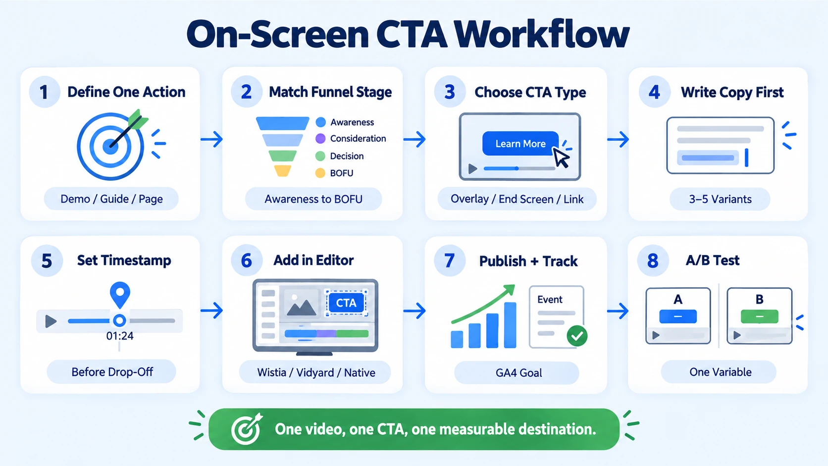
- Define the single action you want: One video, one CTA. Reducing to one CTA per page can boost conversions by 266%. That principle applies equally to video. Pick the action: book a demo, download the guide, visit the page.
- Match the CTA to funnel stage: Awareness content gets low-friction asks ("Watch the full webinar"). Bottom-funnel content supports higher-commitment asks ("Book a 15-minute call"). LinkedIn ads need to be benefit-driven to appeal to B2B SaaS, AI, and tech startup decision-makers, the key is to be as specific as possible on pain points and link them to a benefit.
- Choose your CTA type: Decide between a clickable overlay button, an end screen, a pinned comment link, or an in-video annotation. Each serves a different intent and platform.
- Write the copy first: Before you touch your editor, write 3–5 CTA variants. Lead with a verb. Test "Get the Playbook" against "Download Free" against "See My Results." ContentVerve's A/B test found "Start my free 30-day trial" outperformed "Start your free trial" by 90% in CTR, one word changed the outcome.
- Set the timestamp: Use your video's engagement drop-off data to find where viewers are still watching. Place the CTA just before that drop-off point.
- Add the CTA in your editor: Tools like Wistia, VidYard, or your native platform editor (YouTube end screens, LinkedIn video overlays) handle the technical placement. For short-form video editing, embedded on-screen text overlays built directly into the edit are often more reliable than platform-native features.
- Publish and track: Set up a Google Analytics goal or platform conversion event tied to the CTA destination URL. Without this, you're guessing.
- A/B test: Change one variable per test cycle. Start with copy, then timing, then design.
End Screen vs. Mid-Roll CTAs: Which One Actually Converts Better?
This is one of the most searched questions in video strategy, and the data gives a clear answer for most B2B use cases. While 96% of creators put CTAs at the end of the video, mid-roll CTAs show higher conversion rates at 16.95%. The reason is retention. By the mid-point of a video, the viewer has already committed time and attention. Trust is established. The CTA hits when receptivity is highest.
Research consistently shows that mid-video CTAs, occurring between 20% and 50% of video length, outperform pre-roll and end-of-video CTAs for sponsored link performance. That said, end screens have a real use case. Nearly 96% of creators place CTAs at the end, because viewers who make it to the end of a video are the most engaged.
For subscription or brand awareness goals, end screens work well. For demo demand and pipeline, mid-roll wins. Combining early, mid-roll, and end CTAs can generate 2–3x higher click-through rates compared to a single end CTA.
For webinar recordings and podcast clips repurposed as video, running a mid-roll and an end-screen CTA together is the strongest combination. Just keep the CTAs consistent in their ask, different actions at different points create friction, not momentum.
What Makes a CTA Button Convert Better: Design and Visual Hierarchy
Once placement is sorted, design determines whether the eye lands on the CTA at all. Visual hierarchy is what pulls attention toward the button before the viewer consciously decides to click. A Hotjar heatmap analysis of 17,500 landing pages revealed that above-the-fold CTAs received 89% more clicks than below-the-fold equivalents.
For on-screen video CTAs, "above the fold" translates to: keep CTA overlays in the upper two-thirds of the frame, away from the bottom edge where platform UI elements (progress bars, like buttons) compete for attention. Key design principles for on-screen CTAs that convert:
- Colour contrast: The CTA button colour should be distinct from the video background and brand colours. High contrast drives attention. A blue button on a blue background is invisible.
- Whitespace: Surround the CTA with visual breathing room. Crowded overlays get ignored.
- Size and tap area: Mobile-friendly CTA buttons with larger touch areas and readable text can improve tap-through rates by over 40%, especially for executives on smartphones.
- Micro-animations: A subtle pulse or fade-in draws the eye without annoying the viewer. Keep it under 0.3 seconds.
- Social proof integration: Adding a single trust signal near the CTA, "Trusted by 200+ SaaS, AI, and tech teams", anchors credibility at the moment of decision.
Including a CTA inside video content can drive up to 380% more conversions than the same CTA placed in a sidebar. The frame is prime real estate, treat it that way.
For motion graphics-driven videos, an animated CTA card built into the edit performs better than a static overlay added post-production. The motion creates a visual event that holds attention at the exact moment you need it.
How to Write CTA Text That Gets Clicks on Video Content
Copy is where most on-screen CTAs die. "Learn More" is not a CTA, it's a placeholder. Adding on-screen CTAs that convert requires copy built around three things: a strong verb, a clear benefit, and minimal friction. Action verbs are the backbone of effective CTAs, they prompt users to take specific, immediate steps, leaving no room for ambiguity. High-converting CTAs for B2B SaaS, AI, and tech startups use clear action verbs and specific outcomes. Phrases like "Get," "Start," "Book," and "See" work best when paired with a concrete benefit or next step. Use first-person framing on buttons. The psychology is clear: "my" triggers the endowment effect, making users feel ownership of the action. Best practice is to use "you/your" in body copy to address readers directly, then switch to "I/my" in button text to transfer ownership at the conversion point. Here are CTA copy examples mapped to video goals for B2B SaaS, AI, and tech teams:
Keep button copy to 2–5 words. The optimal CTA length averages around 3.4 words, buttons written like a full sentence convert worse. For urgency and scarcity, use it only when real. Ensure any power word is truthful, don't say "exclusive" if it isn't, and avoid words that feel gimmicky to a C-suite audience.
A/B Testing and Optimising On-Screen CTAs With Data
The best CTA is never the one you think, it's the one the data confirms. Systematic A/B testing is how adding on-screen CTAs that convert becomes a repeatable system rather than a one-time guess. A/B testing CTA wording, placement, and design yields 28% higher conversion rates on average. The key word is "or", test one variable per cycle.
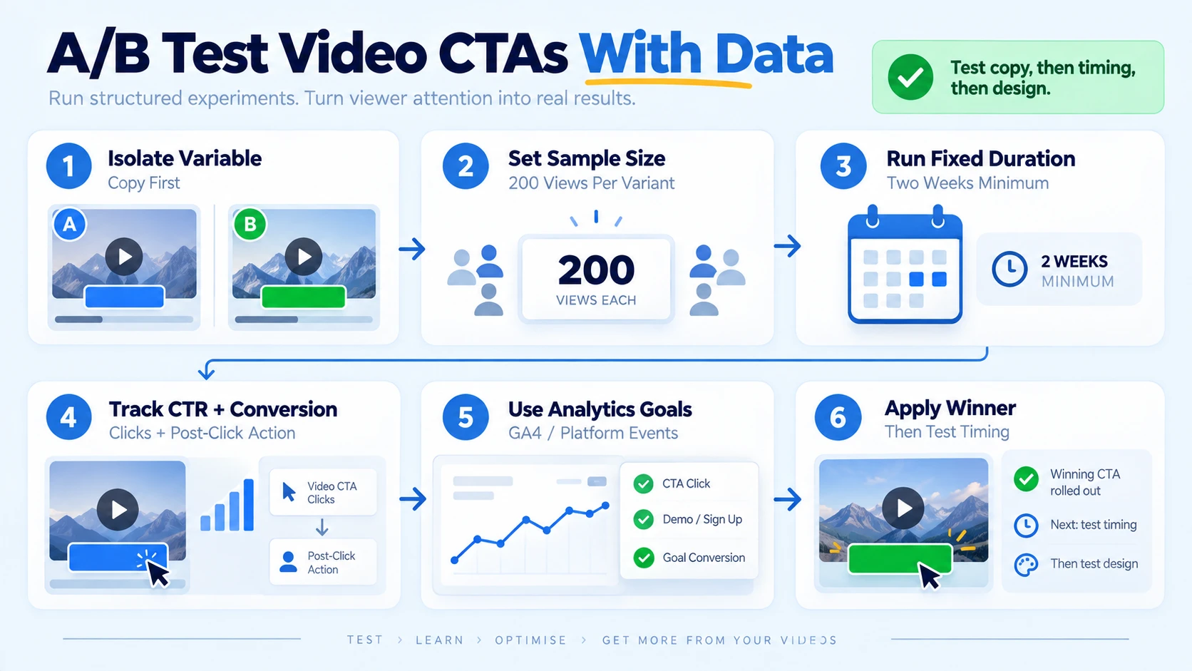
How to run a clean CTA test on video:
- Isolate the variable: Test copy only first. Keep timing, design, and destination identical.
- Set a minimum sample size: Don't call a winner on fewer than 200 views per variant. Small samples produce misleading results.
- Run the test for a fixed duration: Two weeks minimum, or until statistical significance is reached.
- Measure the right metric: CTR measures clicks. Conversion rate measures what happens after the click. Track both.
- Use platform analytics or GA4 goals: Set Google Analytics Goals tied to your CTA destination. This connects video CTA performance to actual pipeline, not just clicks.
- Apply the winner, then test the next variable: Move to timing, then design, then button color.
Systematic CRO programmes that include CTA testing deliver cumulative annual improvements of 25–40%. Heatmap analysis tells a different story than raw click data. For landing pages where your video lives, tools like Hotjar reveal whether viewers are even reaching the CTA or bouncing before it loads. If the heatmap shows low scroll depth, the problem isn't the CTA, it's the page.
Wistia analyzed over 36,000 CTAs in hosted videos in 2024 to determine how placement on the timeline impacts conversion rates, their platform analytics are the gold standard for this kind of timing optimisation. For teams using our video editing services to build content libraries from webinars, podcasts, and demos, I always recommend tagging each CTA variant so performance data maps back to the original content type.
When looking at various video types, CTAs tend to have higher conversion rates with original series, on-demand webinar recordings, and sales videos, which tracks perfectly with what we see in B2B SaaS, AI, and tech startup content repurposing.
Conclusion
Adding on-screen CTAs that convert is a system, not a single tactic. Here's what drives results:
- Placement beats design: Get mid-roll timing right before touching button colours or animations.
- Copy is the highest-leverage variable: Benefit-driven, first-person action verbs outperform generic text every time.
- One CTA per video: Multiple asks create confusion; a single, clear directive creates momentum.
- Test and track systematically: One variable, fixed duration, GA4 goal tied to the destination, this is how CTAs improve over time, not by gut feel.
If you want help building video systems that turn product knowledge and founder thinking into pipeline for B2B SaaS, AI, and tech startups, Komet Media's services are built for exactly that.
For B2B SaaS, AI, and tech teams without existing video assets or recordings, Komet Media also offers a complete 'from scratch' production workflow. They build custom creative libraries from the ground up by handling buyer research, scripting ad concepts, providing recording guidance, and managing post-production and multi-platform formatting.
Frequently Asked Questions
Q1: How many CTAs should I include in a single video?
One primary CTA per video is the strongest approach. Reducing to one CTA per page can boost conversions by 266%. If your video is long (10+ minutes), you can add a secondary mid-roll CTA that mirrors the same ask, just don't introduce competing actions.
Q2: What is the best time to place a CTA in a short-form video?
Short videos under 30 seconds often perform best with CTAs at the beginning or end. For a 60-second product clip, placing the CTA at the 35–45 second mark captures viewers who are engaged but haven't yet navigated away.
Q3: Why are my video CTAs getting views but no clicks?
The most likely cause is copy-intent mismatch. Your CTA is asking for too much too soon, or it's too vague to communicate value. Review whether your button text states a clear benefit, and whether the ask matches where the viewer is in the funnel.
Q4: Do on-screen CTAs work better than description link CTAs?
Description links in the first 3 lines (above the fold, visible without clicking "Show More") receive 3–8x more clicks than buried links. On-screen CTAs and above-the-fold description links work best together, use both, with the same destination.
Q5: How do I make my CTA accessible on mobile?
Optimizing a CTA specifically for mobile screens can improve conversion rates by 32.5%. Ensure button tap areas are at least 44x44px, text is legible at small screen sizes, and the CTA is positioned in the upper two-thirds of the frame to avoid overlap with platform UI elements.
Q6: What's the difference between a clickable CTA overlay and an end screen?
A clickable overlay appears during playback, it can be placed at any timestamp and keeps the video running. An end screen replaces the final frames and is platform-native on YouTube. In the traditional approach, the CTA appears at the end of the video after viewers have received all the necessary information, this works particularly well for explainer videos and brand awareness campaigns. Overlays give you timing control; end screens give you platform integration. Use both for maximum coverage.

